Müller changed visual identity for its white dairy products in Romania
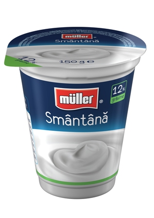
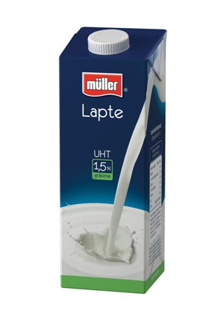
Müller launched, starting May, a new visual identity for its white dairy products available on Romanian market.
Starting from the attributes that define the brand, Muller and its Romanian creation agency Jazz came up with a packaging design that is fresh, minimalist and focused on the product
The new packaging was created to meet consumers’ expectations from company’s products: quality with no compromises from taste and design point of view
The change in design also complies with EU regulations that impose a clear labeling and a better visibility for the defining elements of a dairy product.


One thought on “Müller changed visual identity for its white dairy products in Romania ”
Comments are closed.